
In this blog post, we are going to explore how a 3rd party library can be added to Oracle APEX. In particular – we are going to look at how to integrate Google Material components to Oracle APEX. I’m going to assume you have an intermediate knowledge of APEX but I’m not going to assume you have any exposure to Google’s Material.
The tutorial
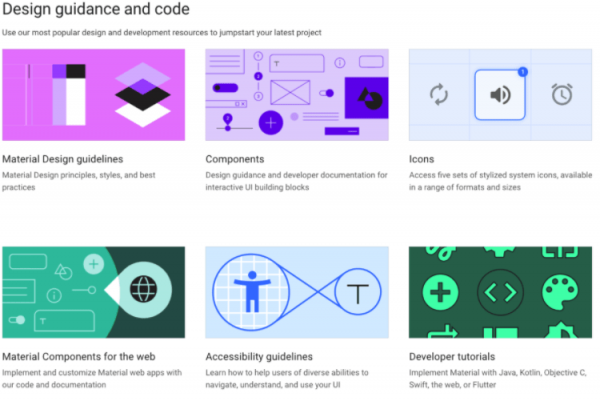
Let’s begin with an overview of Material. Google’s Material is an open-source project/design philosophy that offers a stunning open-source selection of components and features. Head to https://material.io to check it out.
Integrating Google Material components into Oracle APEX can describe a broad spectrum of workflows – today we’re going to pick a relatively simple workflow in which we simply copy and paste from Material into our APEX application.
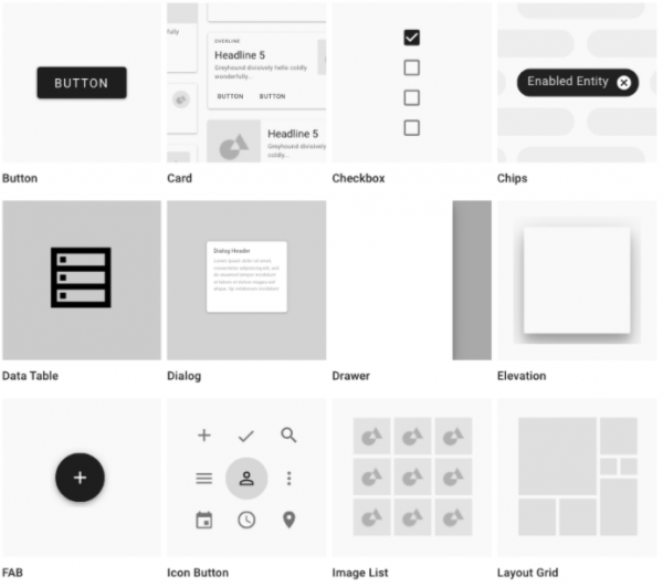
As APEX developers, we are interested in “Web” components, so head to https://material.io/develop/web/ and explore the components menu in the left hand nav. Take your time to admire the components on offer. There’s a lot to study here.
A few component feature comparisons between Material and APEX’s Universal Theme
All of the Material designs were built on the concept of “quantum paper” – Google dreamed up a universe in which your computer screen peers into a paper theatre stage – on which highly responsive paper moves and transforms across your screen in magical but fundamentally consistent and intuitive ways. Here are a few thoughts I have about how Material compares to Universal Theme from a component feature perspective (so I’m not going to mention layout, movement, color, or versatility).
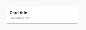
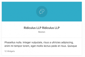
Card Component
| Material Card Component | vs. | APEX Card Component |
|---|---|---|
 |
 |
|
| Shadow coming in at 45 degree angle communicates clearly that the card represents a piece of paper elevated from the background. | What could be described as “shadow” uniformly frames the card in a less obvious metaphor. |
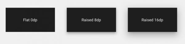
Elevation
| Material Elevation | vs. | APEX Elevation |
|---|---|---|
 |
 |
|
| Material allows you to configure the elevation of your components to communicate clear relationships in your screen’s z-space. | APEX provides an illusion of elevation for many of its components but the shadow is not as convincing because it is so uniform. |
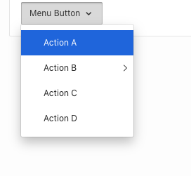
Call-to-Action button
| Material Floating Action Button (FAB) | vs. | APEX Primary Hot Button |
|---|---|---|
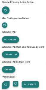 |
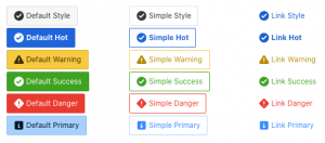 |
|
| Material offers a Call-to-Action button that is both elegant in design. “Only one floating action button is recommended per screen to represent the most common action.” | APEX suggests you use the “Hot” and “Primary” options to identify your Call-to-Action button |
Table
| Material Table | vs. | APEX Table |
|---|---|---|
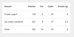 |
 |
|
| The tabular representation of data is not Material’s strong suit. | APEX’s rich library of table options is without compare. |
Back to the tutorial
I propose we make use of the Material Card component in our tutorial because it has no clear substitute on the APEX side. If you want a card layout similar to this in APEX – you’re going to have to write some HTML and CSS no matter how you go about it.
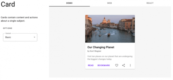
To see some easy and interactive demos of these components, find the Github link at the bottom of the page – then – click into the material-components-web repository and find the “Demos” link. You’ll be taken to the https://material-components.github.io/material-components-web-catalog/#/ where many of the components have demo pages, each of which are worth careful study.
These Demo pages show off how different combinations of HTML elements and classes can produce very different results. Click into the “Card” example and toggle the “options” drop-down to get a sense of this:
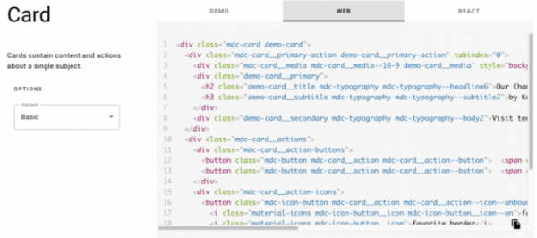
The example HTML is helpfully seeded with some provisional classes that you can use to target with your own CSS – this “demo-card” class for example. We will have to write our own CSS for these classes (as we will see later):
Prepare your APEX application for material components
Let’s switch gears and prepare an APEX application to accept the material component HTML. For the benefit of those who want to follow along at home, I’m installing the Sample Database application from the Sample App Gallery. I can recommend getting a free workspace at apex.oracle.com for this purpose.
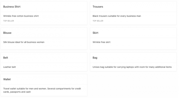
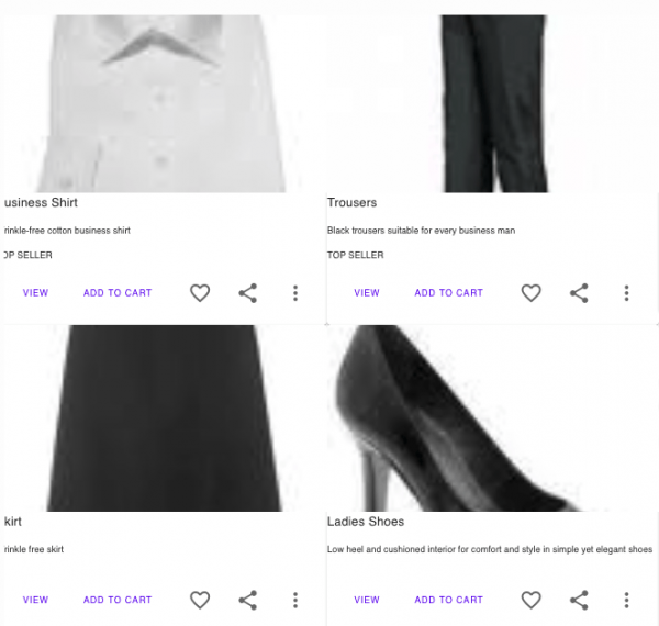
Once it’s installed, let’s navigate to the products page – I chose this sample app because it features images. We can combine these images with the Material component card to create something that looks more like a blog or a commercial website.
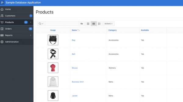
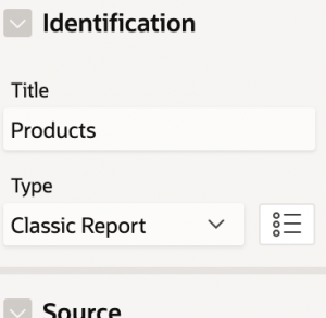
Start by copying this page to a new page. On my new page, I’m going to switch the interactive report to a classic report so that I can make use of the existing “card” theme architecture.
I’ll rename my field names in the SQL in anticipation of feeding them into my card template, as below:
select p.product_id,
       p.product_name CARD_TITLE,
       p.product_description CARD_TEXT,
       p.category,
       decode(p.product_avail, 'Y','Yes','N','No') product_avail,
       p.list_price,
       (select sum(quantity) from demo_order_items where product_id = p.product_id) units,
       (select sum(quantity * p.list_price) from demo_order_items where product_id = p.product_id) sales,
       (select count(o.customer_id) from demo_orders o, demo_order_items t where o.order_id = t.order_id and t.product_id = p.product_id group by p.product_id) customers,
       (select max(o.order_timestamp) od from demo_orders o, demo_order_items i where o.order_id = i.order_id and i.product_id = p.product_id) last_date_sold,
       p.product_id img,
       apex_util.prepare_url(p_url=>'f?p='||:app_id||':6:'||:app_session||'::::P6_PRODUCT_ID,P6_BRANCH:'||p.product_id||','||3,p_dialog=> 'null') CARD_LINK,
       decode(nvl(dbms_lob.getlength(p.product_image),0),0,null,
       '<img alt="'||apex_escape.html_attribute(p.product_name)||'" title="'||apex_escape.html_attribute(p.product_name)
              ||'" style="border: 4px solid #CCC; -moz-border-radius: 4px; -webkit-border-radius: 4px;" '
              ||'src="'||apex_util.get_blob_file_src('P6_PRODUCT_IMAGE',p.product_id)||'" height="75" width="75" />') detail_img,
       decode(nvl(dbms_lob.getlength(p.product_image),0),0,null,
       apex_util.get_blob_file_src('P6_PRODUCT_IMAGE',p.product_id))
       CARD_IMAGE,
       tags CARD_SUBTEXT
from demo_product_info p
That done, let’s take a look at the existing card layout in the runtime environment:
Add Material Dependencies
Ok, with that, let’s go ahead and begin adding Material dependencies to our App. 1st – we need to add the necessary CSS and JS file references. Material offers many ways to do this but the simplest is simply to reference their CDN. To find this – we navigate back to material.io, go to Develop then Web and click “getting started”.
https://material.io/develop/web/docs/getting-started/
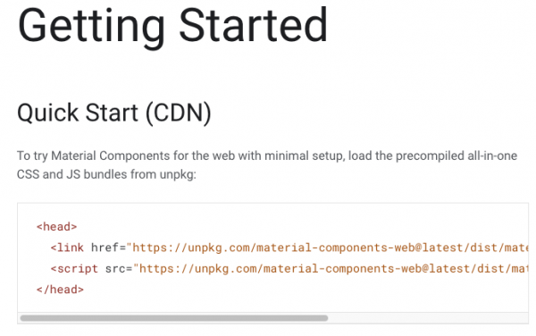
Capture the 2 CSS files:
https://unpkg.com/material-components-web@latest/dist/material-components-web.min.css
Capture the 1 JS file:
https://unpkg.com/material-components-web@latest/dist/material-components-web.min.js
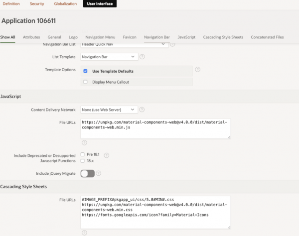
We can then simply copy and paste the links into the appropriate sections of our application attributes. In the User Interface tab, we paste the component web css in the cascading style sheet File Urls area, the component web javascript in the Javascript File Urls area and the Material Icons css also in the css area:
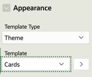
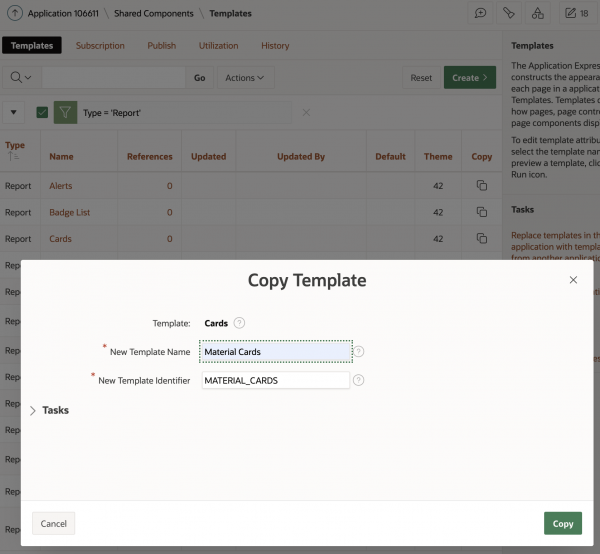
Now let’s head to our Templates, under Shared Components. I find the “card” template that I’m currently using and copy it to a new custom template:
Let’s capture the HTML from the demo website we saw earlier: https://material-components.github.io/material-components-web-catalog/#/component/card. We must modify the HTML to include
- the <li> elements at the beginning and end, per the architecture of the native APEX card element
- the substitution strings that we prepared in our SQL earlier
<li class="demo-li #CARD_MODIFIERS#">
  <div class="mdc-card demo-card">
    <div
      class="mdc-card__primary-action demo-card__primary-action"
      tabindex="0"
    >
      <div
        class="mdc-card__media mdc-card__media--16-9 demo-card__media"
        style="background-image: url('#CARD_IMAGE#');">
      </div>
      <div class="demo-card__primary">
        <h2 class="demo-card__title mdc-typography mdc-typography--headline6">
          #CARD_TITLE#
        </h2>
        <h3 class="demo-card__subtitle mdc-typography mdc-typography--subtitle2">
          #CARD_TEXT#
        </h3>
      </div>
      <div class="demo-card__secondary mdc-typography mdc-typography--body2">
        #CARD_SUBTEXT#
      </div>
    </div>
    <div class="mdc-card__actions">
      <div class="mdc-card__action-buttons">
        <a
          href="#CARD_LINK#"
          class="mdc-button mdc-card__action mdc-card__action--button">
          <span class="mdc-button__ripple"></span> View
        </a>
        <button class="mdc-button mdc-card__action mdc-card__action--button">
          <span class="mdc-button__ripple"></span> Add to cart
        </button>
      </div>
      <div class="mdc-card__action-icons">
        <button
          class="mdc-icon-button mdc-card__action mdc-card__action--icon--unbounded"
          aria-pressed="false"
          aria-label="Add to favorites"
          title="Add to favorites">
          <i
            class="material-icons mdc-icon-button__icon mdc-icon-button__icon--on">favorite</i>
          <i class="material-icons mdc-icon-button__icon">favorite_border</i>
        </button>
        <button
          class="mdc-icon-button material-icons mdc-card__action mdc-card__action--icon--unbounded"
          title="Share"
          data-mdc-ripple-is-unbounded="true">
          share
        </button>
        <button
          class="mdc-icon-button material-icons mdc-card__action mdc-card__action--icon--unbounded"
          title="More options"
          data-mdc-ripple-is-unbounded="true">
          more_vert
        </button>
      </div>
    </div>
  </div>
</li>
After saving that, return to the page designer where we have the APEX Classic Report with the Cards Theme. Let’s switch the template to our newly created custom theme “Material Cards”:
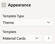
If you run the page at this point, it won’t look quite right because it’s missing the custom CSS that we have to write:
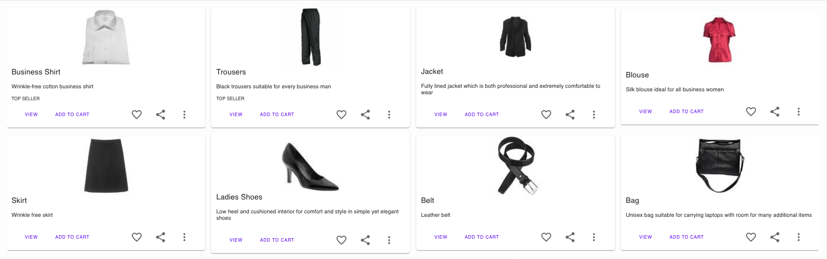
Next, let’s write a little CSS. I think we can get some attractive results with just the basics (advice: don’t attach CSS to non-custom classes):
.demo-li {
    display:block;
    margin:auto;
    padding:5px;
}
.demo-card {
    padding:0 10px;
    width:400px;
}
.demo-card__media {
    width:120px;
    height:120px;
    display:block;
    margin-left:auto;
    margin-right:auto;
}
.demo-card__title {
    font-size: 1.5rem;
}
.demo-card__subtitle {
    font-size: 1.1rem;
}
With the addition of this custom CSS, we now have something that I think looks acceptable:
Congrats! This completes our tutorial on how to integrate Material Components with Oracle APEX.
Further watching
For those of you who like watching videos, I assembled the following youtube tutorial, which comes in at a succinct 7.5min.
Further reading
This post follows the Insum Insider Webinar Series Adding 3rd party design libraries to APEX – Google’s Material Design (May 14th, 2020). This webinar serves as a follow-up to my previous blog post APEX should be beautiful in which I talk about the opportunity presented by integrating with 3rd party design libraries.

Hi Erjilo – glad to hear you like the website. I am eager to correct any spelling mistakes that exist. We always run the blog through Spell Check so we are unaware of any existing spelling errors. I would be grateful if you could reply to this thread with any examples of what you are referring to. Thank you.
Nice Hayden!
This is really informative blog on adding material components to Oracle Apex.